Did you know that your resume has 7.4 seconds to make an impression? Hiring managers and recruiters evaluate hundreds of resumes every day. To stand out from the competition, visual resumes have become a popular trend but do they live up to the hype? We explore some do’s and don’ts for creating your own visual resume.
Overview
- Your resume has 7.4 seconds to make an impression
- Color, graphics, and images can set you apart from the competition
- Visual resumes may be better for applicants applying for creative roles
- The content of your resume will always be more important than how it looks
What is a Visual Resume?
Visual resumes, sometimes called graphic resumes or visual CVs, are an alternative to traditional resumes. They use color, graphics, charts, and unique layouts to draw attention to an applicant’s skills and experience.
Why Choose a Visual Resume?
Visual resumes are memorable. They stand out easily from a stack of plain ones, which can work to your advantage. They also allow you to showcase your personality and creative side, which benefits applicants seeking roles that require those skills.
The Do’s and Don’t of Visual Resumes
- Do Avoid Chart Junk!
- Do Use Color to Make Traditional Resume Formats Stand Out
- Do Avoid Color and Fonts That Are Difficult to Read
- Don’t Skimp on Job Descriptions
- Don’t Be Afraid of Whitespace
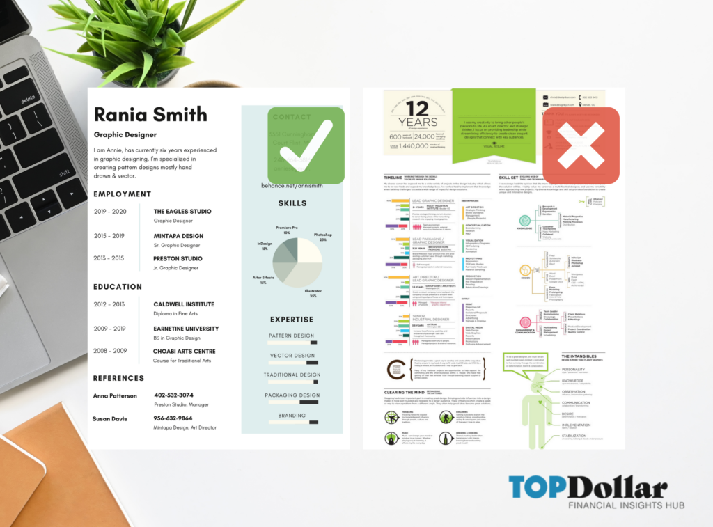
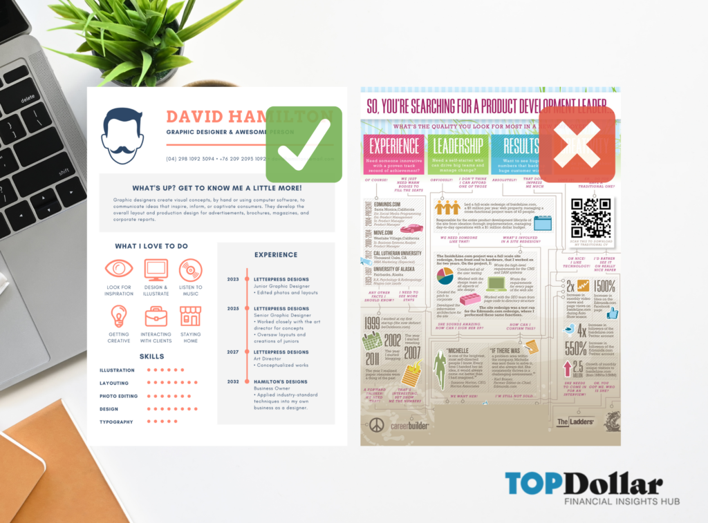
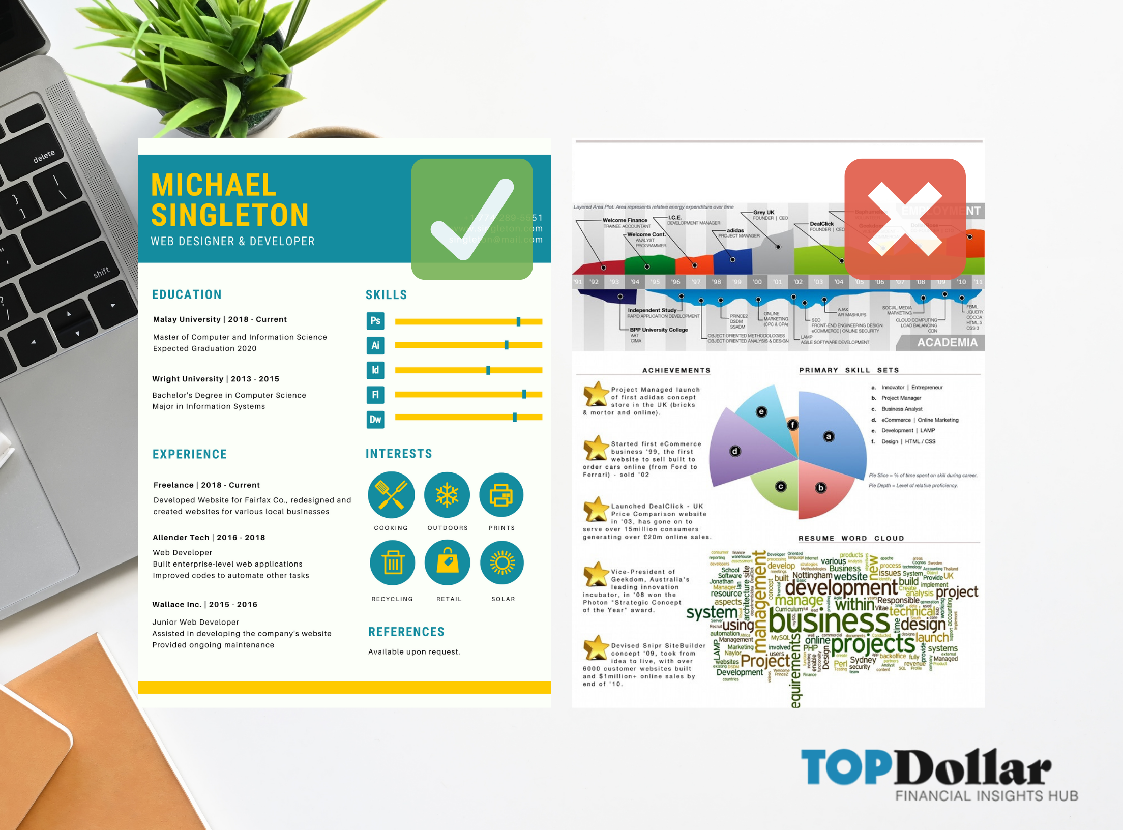
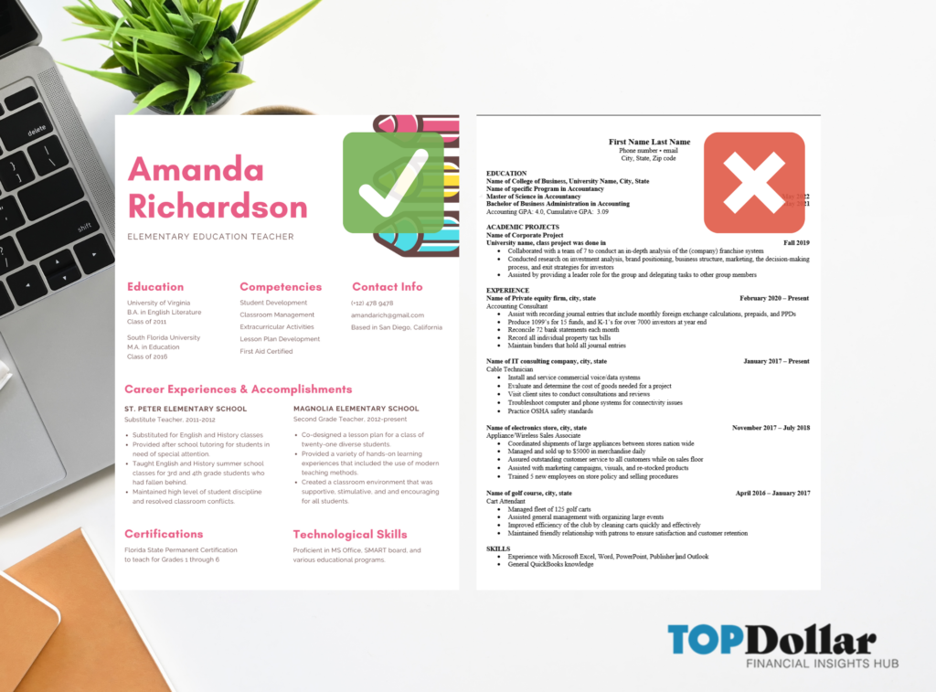
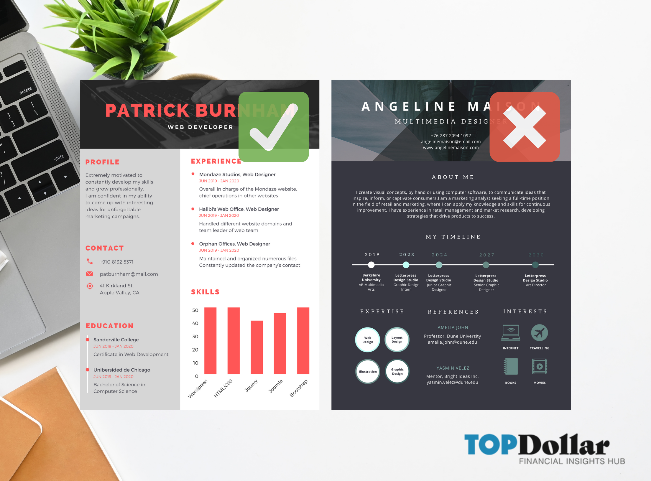
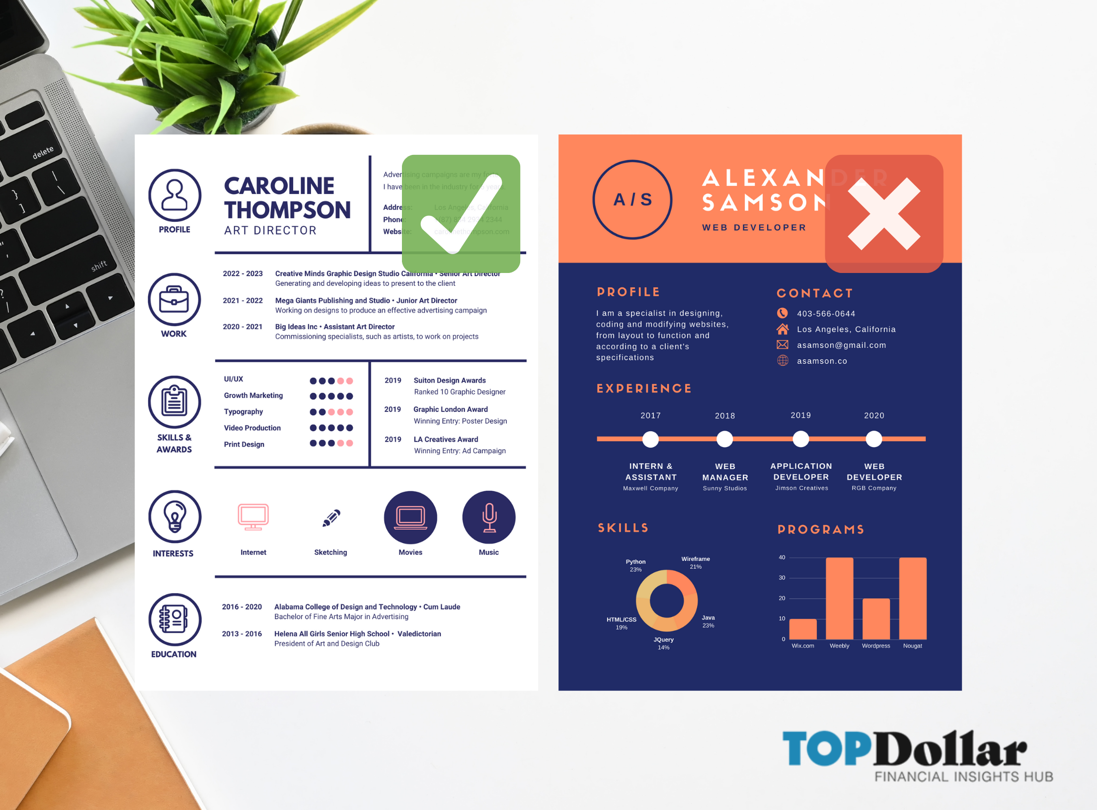
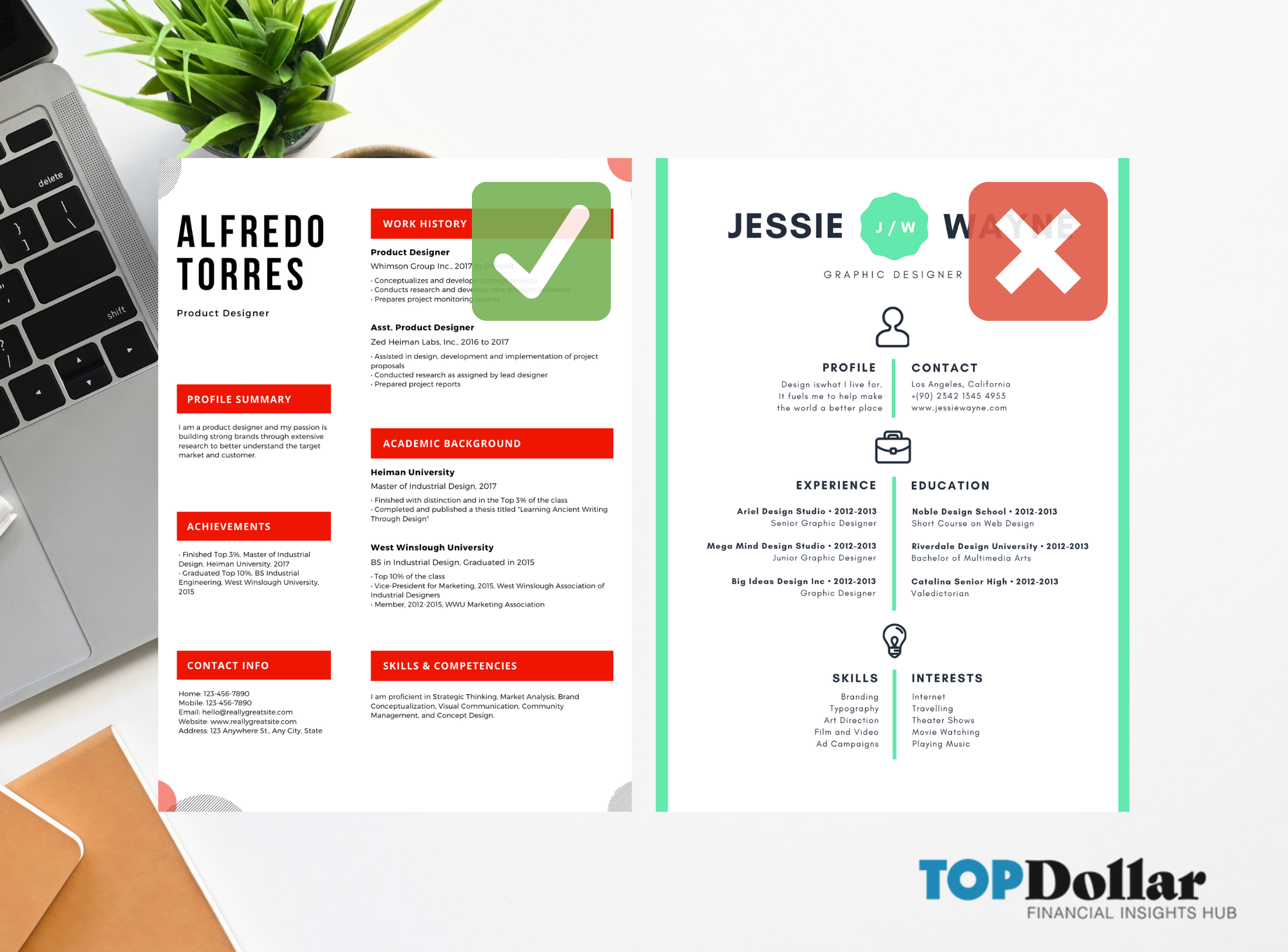
1. Do Avoid Chart Junk!
Fun icons and charts show your playful and creative side, but if they aren’t executed correctly your resume might stand out for the wrong reasons. Every chart, icon, or graphic needs to serve a purpose and convey important information that is essential to the recruiter.
You want to have plenty of whitespace on your resume, so think of charts and graphics as a way to say more about yourself without using words.
Try this: After you create your visual resume, give it to a friend or colleague who has never seen it before. Ask them to look at the resume for 7.3 seconds, then recall from memory what stood out most.


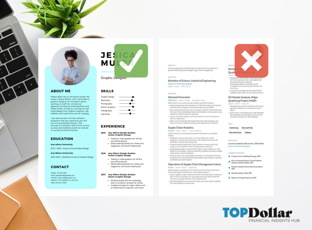
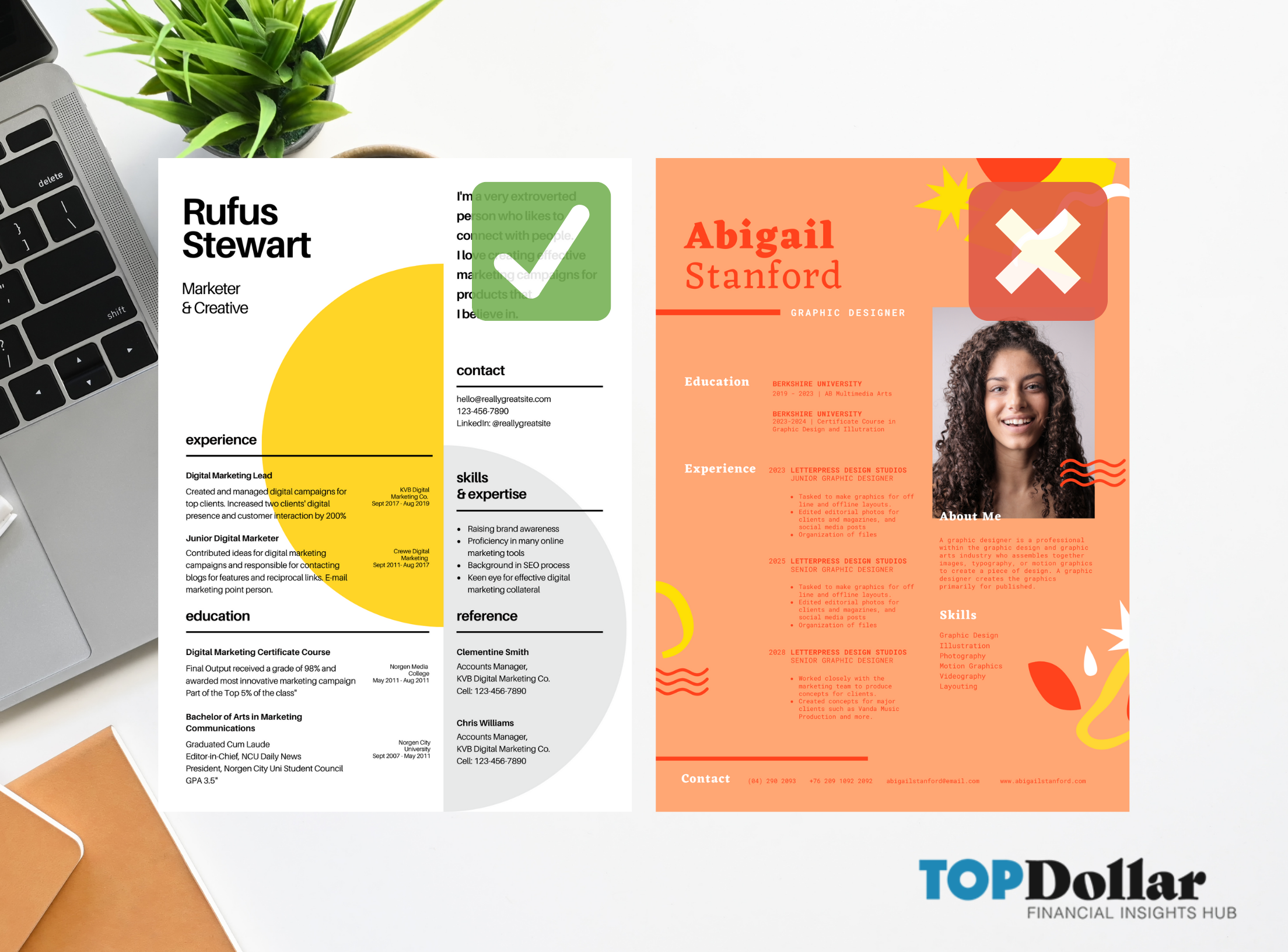
2. Do Use Color to Make Traditional Resume Formats Stand Out
Adding color is a quick way to make a traditional resume format more memorable, no graphics required! Colorful resumes make a strong first impression, showcase your personality, and can help draw the eye to important information.
When used correctly color is an effective tool and can:
- Direct the eye to important information
- Demonstrate compatibility with company culture
- Highlight an applicants creativity


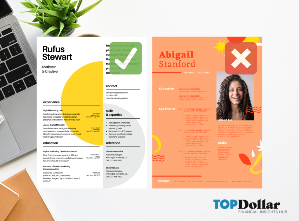
3. Do Avoid Colors and Fonts That Are Difficult to Read
Bright colors help show your personality but may be difficult to read. As a rule of thumb, bright colors work well for fonts, headers, and icons, but don’t work well as backgrounds.
When choosing colors try to keep the color palette. Pick are primary colors and, if needed, one or two accent colors. Although resumes may be viewed online
- Keep Your Color Palette Simple
- Use color to draw the eye to specific details or separate sections


4. Don’t Skimp on Job Descriptions
On one hand, you want your resume to look clean and uncluttered, on the other you want your prospective employer to get a strong sense of your skills and accomplishments in past positions.
In some instances, job titles speak for themselves and you can showcase critical hard and soft skills elsewhere on your resume. However, as a general rule, it’s a good idea to include a short sentence or description with every job title.
Try this: Instead of focusing on “duties” focus on the value that you brought to the position.

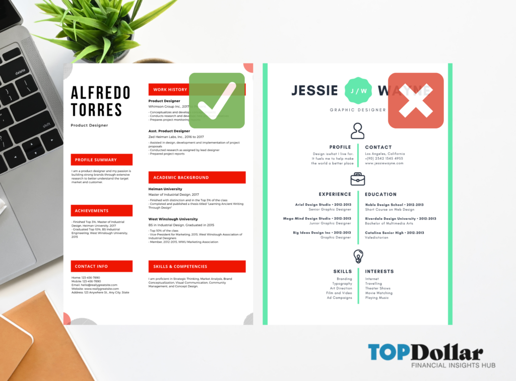

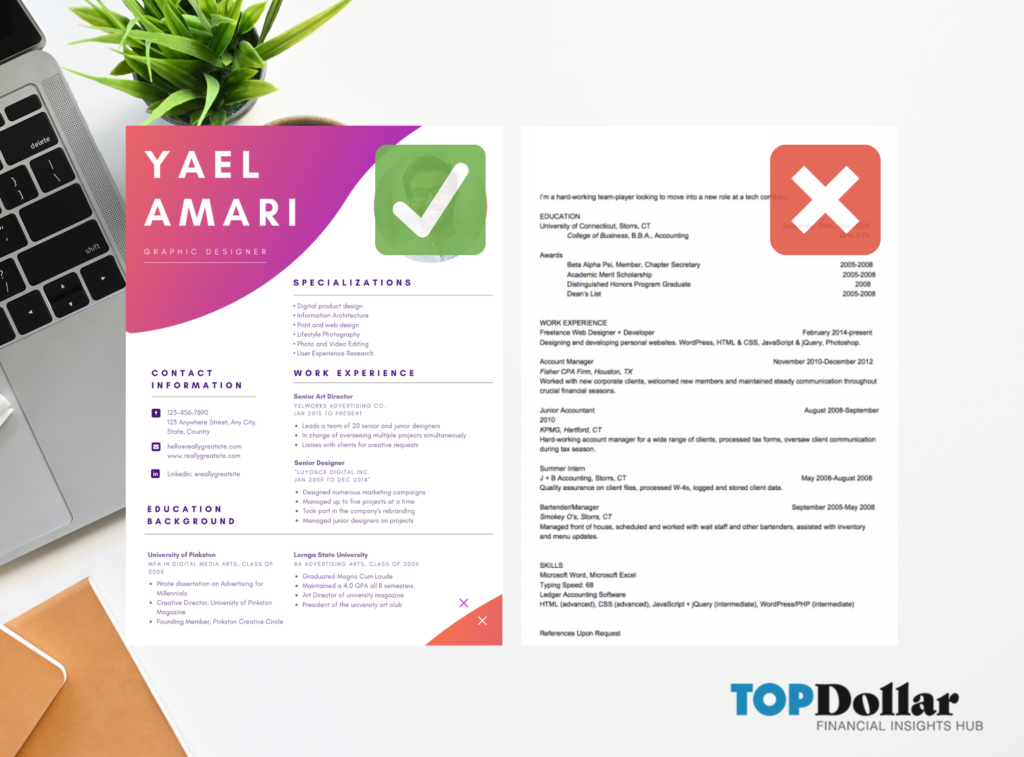
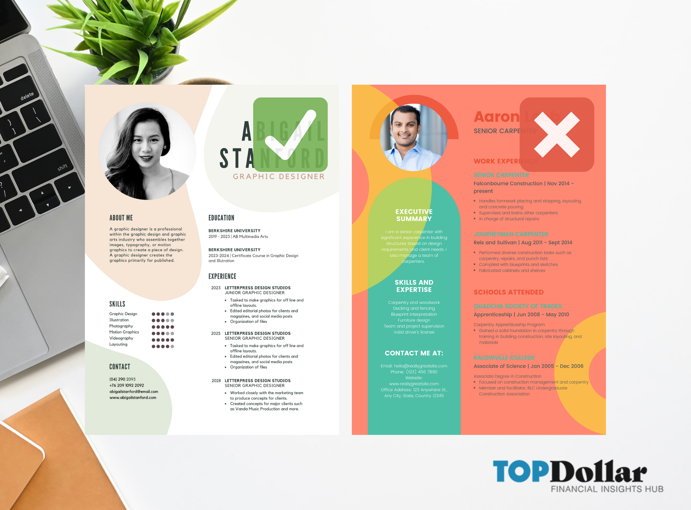
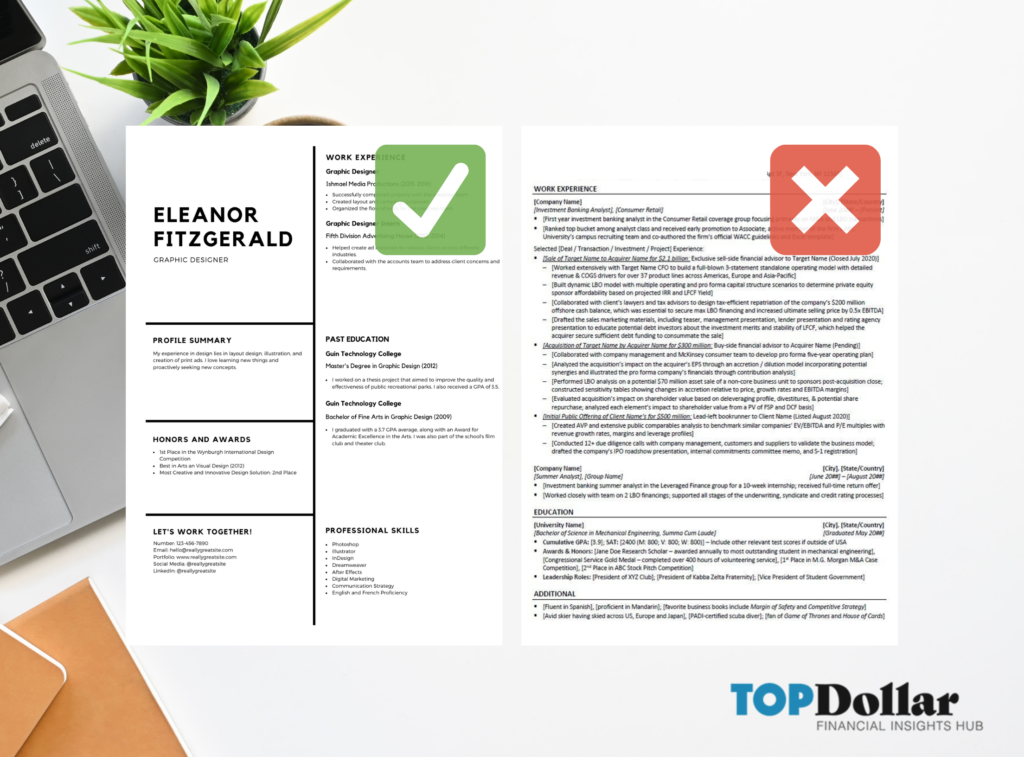
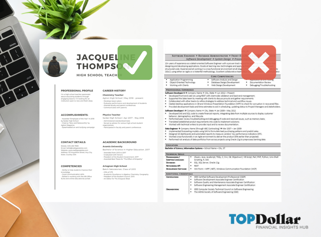
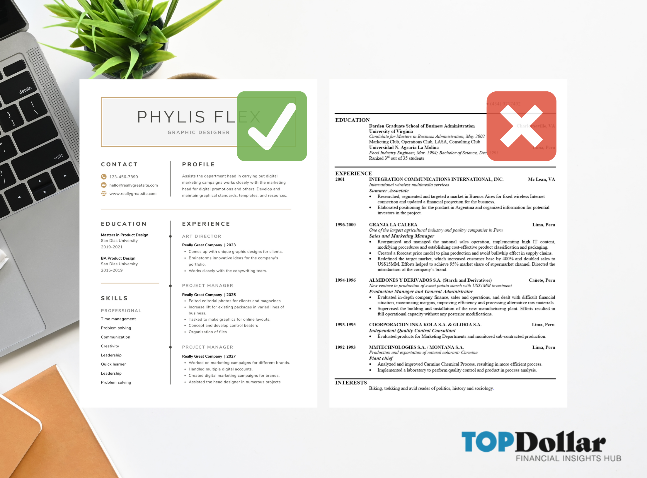
5. Don’t Be Afraid of Whitespace
At first glance, these resumes are pretty traditional but one has an apparent visual advantage. What you don’t include on your resume can be just as important as what you include because it allows your resume to breathe.
Whitespace adds a layer of style to your resume but adds emphasis to vital information. It may even leave the recruiter or hiring manager wanting more, which can be a good thing when they are impressed with what they’ve seen so far.
Afraid of leaving something out? Consider putting together a digital resume so you can showcase your work or CV online.


Visual Resume Tips and Tricks
- Use two to three columns to organize your content and give the eye clear paths to follow
- Use pops of color for graphics and headers, but stick to a simple color
- Stay away from colorful backgrounds which will be hard to read
- Leave ample white space so the resume doesn’t feel crowded
Find a Resume Template Online
Not a graphic designer? Most of the examples in this blog are templates that can be found on Canva.com. Canva is a free graphic design platform, used to create graphics, presentations, posters, documents, and other visual content.
The app includes templates, like the ones used in this blog. The platform has an extensive free version, however, there are also paid subscriptions for business users that offer additional functions like team sharing, premium templates, stock images, and brand kits to fully automate the design process.
Have a Plain Version of Your Resume on Standby
If you work with a recruiter they may ask you for a plain version of your resume. Some recruiters like to reformat resumes in a plain template before submitting them to clients.
Pass The Applicant Tracking System Test
Ever notice that sites like Glassdoor will autofill your profile after you upload your resume? They are using an applicant tracking system (ATS). ATS is an algorithm that reviews a document or image and extracts information.
Some visual resumes don’t play well with ATS systems. While this is not always the case or even an issue, it’s good to be prepared. You can see how your resume fairs by running it through a free ATS scanner.
One More Thing Before You Go: Content is Essential
Whatever creative design you choose should be in service to the information the resume needs to convey. If it doesn’t satisfy your prospective employer’s needs or expectations, it won’t be effective.
Anyone looking at your visual resume should be able to quickly find the information they need and never at the expense of a pretty graphic or layout.
Sources: Resume examples taken from Canva.com (a free graphic design app). Additional examples are from real applicants and names have been obscured to protect the creator’s identity.